CDS, the Consistency Design System
Senior UX/UI Designer, TELUS Health (formerly LifeWorks)
2019 to 2025
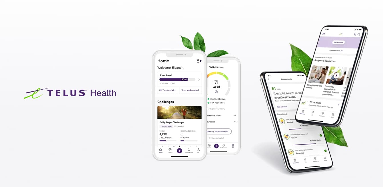
The problem
LifeWorks shipped a family of products that had grown up separately. Benefits enrollment, retirement planning, pension dashboards, and workplace health analytics all worked, and none of them felt like they came from the same company. Every team solved the same problems in their own way, which meant users moving between products had to relearn the interface each time, and designers kept rebuilding things that already existed somewhere else.
CDS existed to fix that. One personality, one set of rules, applied across a product family that eventually reached 6 to 8 platforms.
Where I came in
I joined in 2019, when CDS was still a side exploration. It had buttons, type scales, and a handful of common elements. It was not yet a system.
I was hired into a development role, and my first job was turning Tiphaine's designs into reusable components in Storybook, built with HTML and CSS, which engineering consumed as React components. I was the only person doing that work at the time.
That lasted four to six months before I moved fully into UX design. It turned out to be the most useful four months I could have spent, because I spent the next six years designing components with a clear memory of what it takes to actually build and maintain one.
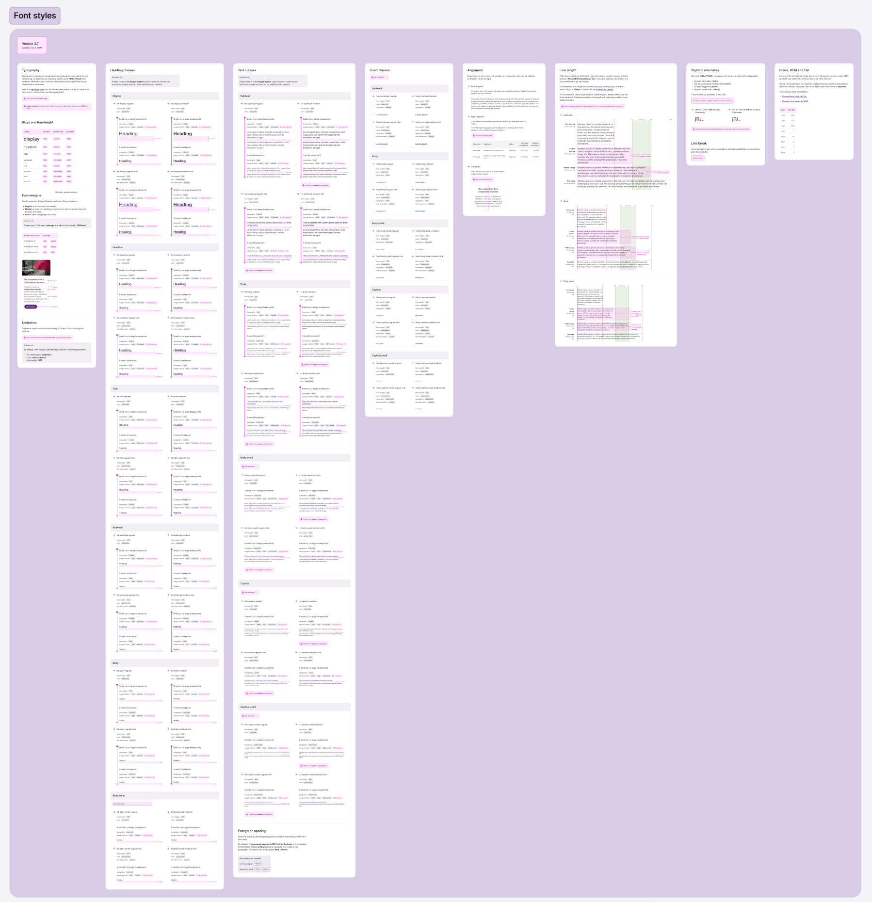
Sheet 1 of 4. Type scales and text styles, part of the foundation layer that existed when I joined.
Click any image to view full size.
How the system actually ran
Five of us met every week. The working model was simple and it held up for six years.
CDS lived in Figma as published libraries, with updates going out roughly monthly. Two lists drove the work: a backlog of component requests from product teams, and a running list of defects in components already in the wild. Each week we prioritized against both.
We deliberately kept room for quick wins. Small, low-effort fixes that unblocked another designer immediately, mixed in alongside the larger pieces. A system team that only ships big releases becomes the place requests go to die, and designers start working around you instead of with you.
Alongside the working group, I ran UI reviews on other designers' work, checking that products were using the system as intended and flagging where they had drifted.
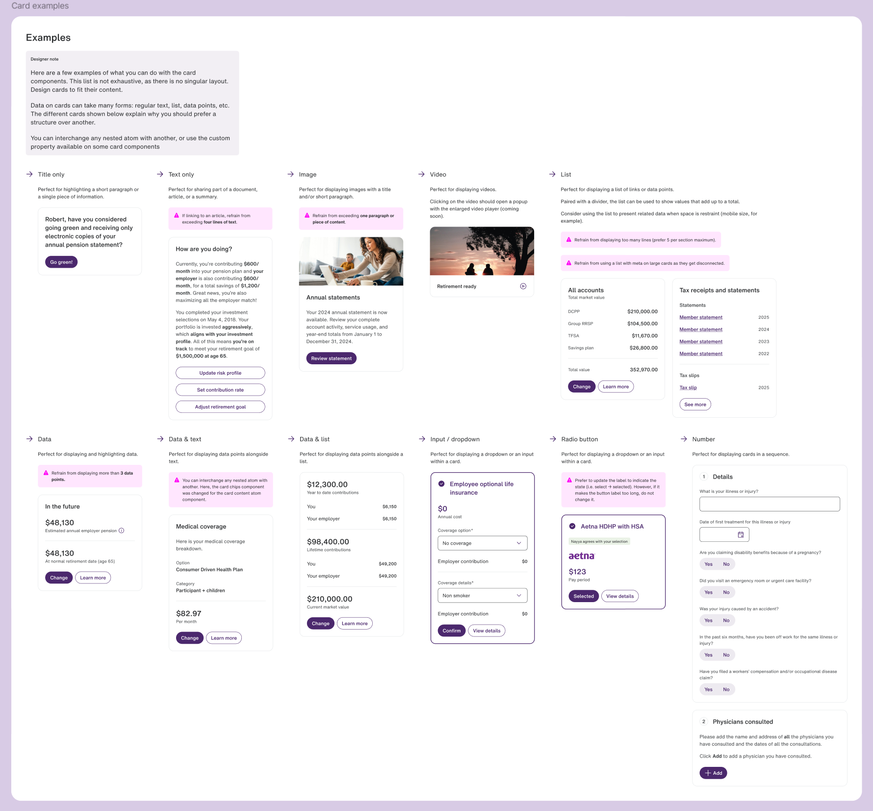
Sheet 1 of 6. Card components with usage guidance built into the sheet itself.
Click any image to view full size.
Data visualization
This is the part I owned.
When I got to it, the data viz guidance in CDS was rough and general. A few charts, a few loose rules. Then I moved onto Insights Lab, a data-heavy analytics product built for employer clients to track workplace wellbeing, claims trends, and cost savings, and the gaps became impossible to ignore. The product needed far more than the system had, so I built it out properly and pushed it back into CDS where every other product could use it.
Accessible multi-series palettes
Charts need a lot of colours at once, and every one of them has to clear contrast requirements, stay distinguishable from its neighbours for colour-blind users, and not collide with the brand palette or the semantic colours already defined in the system. Those requirements pull against each other. Getting a usable range that satisfied all of them was the hardest single problem in the section.
Labelling and interaction rules
How bars and graphs get labelled, how they behave on interaction, and where different chart types belong depending on what the data is doing. Written as guidance rather than examples, so teams could apply it to charts I had never seen.
Loading states
Our data retrieval was slower than we wanted it to be. Rather than design the ideal and hand engineering a problem, I designed for the system we actually had, so a chart waiting on data still looked intentional instead of broken.
Accessibility
Accessibility ran in two layers, because design tools can only catch half of it.
In Figma, we used plugins to surface issues during design, then documented the needs and the changes ourselves based on what the plugins raised. Once a product was built, we ran stronger audits with tools like WAVE to catch everything that only exists in code, ARIA labels included.
The white-label problem
TELUS Health white-labelled products for employer clients, which meant part of our palette arrived from outside the system. Client brand colours were chosen by marketing teams who were not thinking about contrast ratios. One client's brand colour was yellow.
Their logo was their asset and it was not ours to change. What we could control was everything around it. For each client we developed complementary palettes that worked with their brand colour while keeping the content, controls, and data compliant. The logo stayed as it was. The parts people had to read and act on did not.
A point of view on governance
Breaking a design system rule is fine from time to time. It just has to be justified.
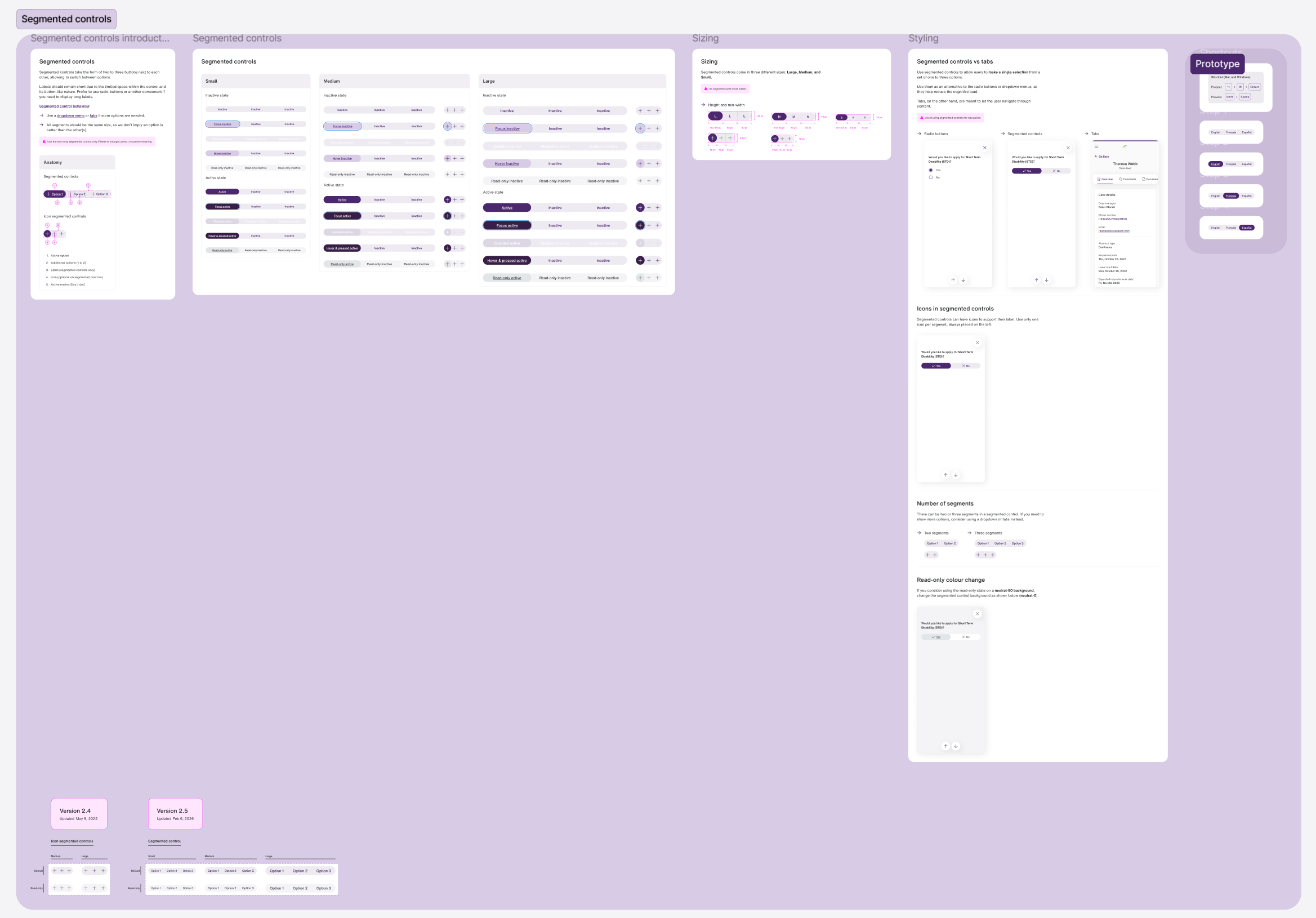
That was the standard I applied in reviews. Designers would occasionally push a component past what it was built for, a segmented control carrying more options than it was designed to hold being the usual one. The question was never whether the system had been broken. It was whether there was a reason worth the inconsistency it created.
The honest arc over six years is that these conversations got quieter. As the library filled out, it covered most of what teams actually needed, and reviews shifted from enforcement toward guidance. A system that people rarely need to break is a system doing its job.
Click any image to view full size.
What happened after the acquisition
TELUS acquired LifeWorks, and TELUS Health had its own design system, THDS. CDS was not renamed or merged. It kept running for all legacy LifeWorks products, which is where the majority of my work stayed.
There was a significant push on branding after the acquisition, colour especially. We made small deliberate pivots inside CDS, aligning things like shadows, border radius, and colour so that if a migration to THDS ever came, the distance would be shorter. We were designing for a decision that was not ours to make, which is its own kind of systems work.
I had some exposure to THDS through a small number of products that used it, but the bulk of my design system work was CDS.
What I would do differently
More granular variants
Some of our components were coarser than they should have been, which pushes designers toward detaching components to get what they need. Every detach is a small leak, and enough of them will quietly drain a system.
More ownership of documentation
Tiphaine carried most of the documentation, and I leaned on that more than I should have. A system is only usable by people outside the working group if it is written down properly, and that means the people building components should be writing about them too.